


1 / 4
0
Views
0
Downloads


0.0
0
0 Likes
Fast Food Line of Best Fit Worksheet - Scatterplot & Correlation
0 Views
0 Downloads
Paste this activity's link or code into your existing LMS (Google Classroom, Canvas, Teams, Schoology, Moodle, etc.).
Students can open and work on the activity right away, with no student login required.
You'll still be able to track student progress and results from your teacher account.
Information
Description
What It Is:
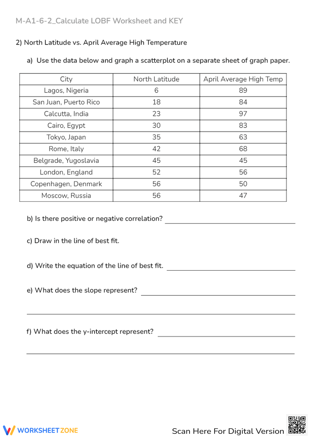
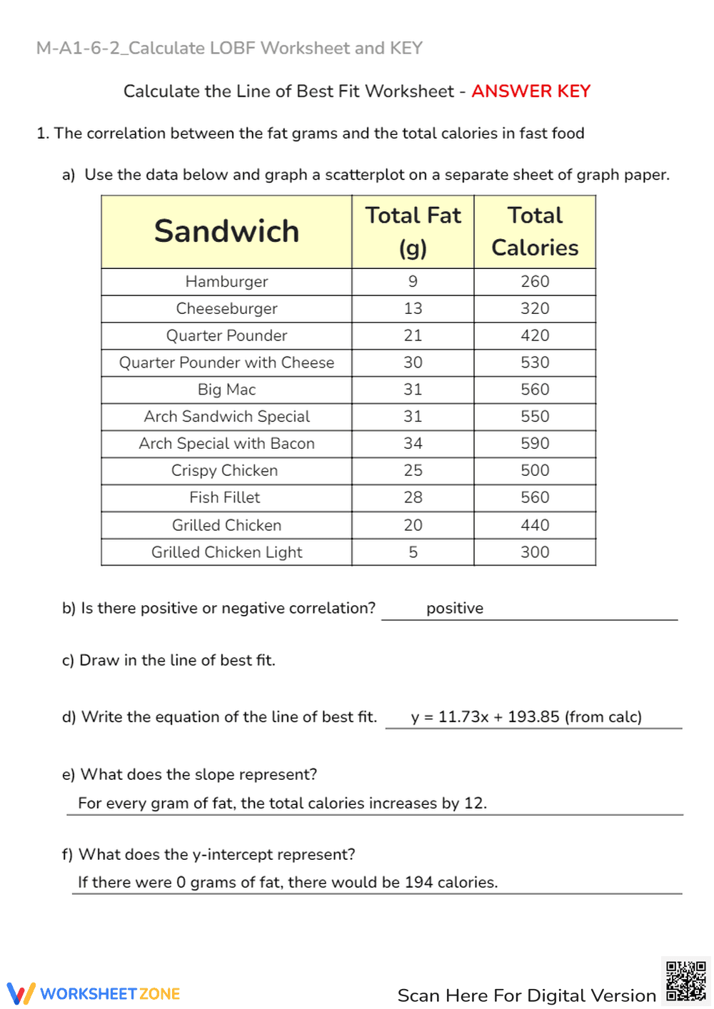
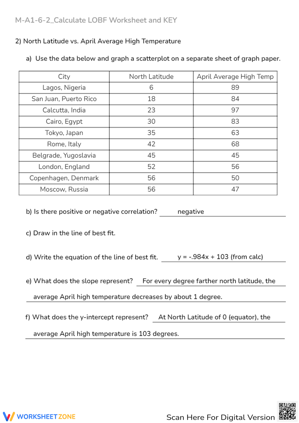
This is a worksheet designed to help students calculate the line of best fit for a scatterplot. It presents a table of data showing the total fat (in grams) and total calories for various fast-food sandwiches. Students are instructed to create a scatterplot from the data on a separate sheet of graph paper. The worksheet then asks students to determine if there is a positive or negative correlation, draw the line of best fit, write the equation for that line, and explain what the slope and y-intercept represent in the context of the data.
Grade Level Suitability:
This worksheet is suitable for high school students, specifically grades 9-12. It requires knowledge of scatterplots, correlation, linear equations, slope, and y-intercept, which are typically covered in algebra and statistics courses.
Why Use It:
This worksheet helps students apply their understanding of linear regression and data analysis to a real-world scenario (fast food nutrition). It reinforces the concepts of correlation, slope, and y-intercept, while also improving their ability to create scatterplots and interpret data.
How to Use It:
First, students should use the provided data table to create a scatterplot on graph paper. Next, they should visually estimate and draw the line of best fit through the data points. Then, they need to determine the equation of the line they drew, identifying the slope and y-intercept. Finally, they should interpret the meaning of the slope and y-intercept in the context of the fat grams and calorie content of the sandwiches.
Target Users:
This worksheet is ideal for high school algebra or statistics students who are learning about linear regression, scatterplots, and correlation. It can also be used for review or as a supplemental activity to reinforce these concepts.