


1 / 2
0
Views
0
Plays


0.0
0
0 Likes
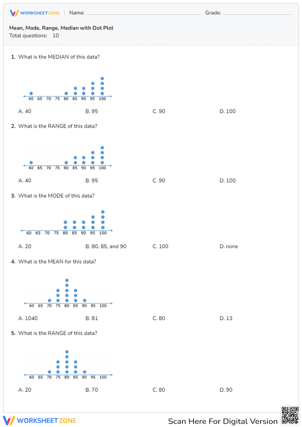
Calculate Mean, Median, Mode & Range with Dot Plots
0 Views
0 Plays
Paste this activity's link or code into your existing LMS (Google Classroom, Canvas, Teams, Schoology, Moodle, etc.).
Students can open and work on the activity right away, with no student login required.
You'll still be able to track student progress and results from your teacher account.
Information
Description
What It Is:
This is a math worksheet featuring a dot plot. The dot plot displays data along a number line, ranging from 60 to 100 in increments of 5. Blue dots are used to represent the frequency of each data point, with the highest frequency at 80.
Grade Level Suitability:
This worksheet is suitable for grades 4-6. It introduces the concept of dot plots and data representation, which are typically covered in these grades. Students can practice reading and interpreting the data displayed.
Why Use It:
This worksheet helps students develop data analysis and interpretation skills. It provides a visual representation of data, making it easier for students to understand frequency and distribution. It also reinforces number line concepts.
How to Use It:
Use this worksheet to introduce or reinforce the concept of dot plots. Students can analyze the dot plot and answer questions about the data, such as finding the mode, range, or making comparisons between different data points.
Target Users:
This worksheet is ideal for elementary and middle school students learning about data representation and analysis. It can also be used for students who need extra practice interpreting graphs.